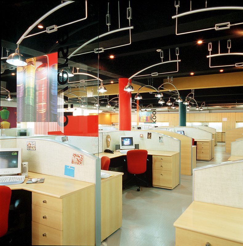
We were asked to design the offices of the Indian info and culture web portal Indya.com. The existing four-storied building was to house 90 people per 4500 sft floor area. Apart from open clusters of workstations in the main work areas, and cabins for VP’s, one floor was to be dedicated to the reception and meeting zones. The brief also called for areas of recreation, a café, and bunk beds for overnight stays.
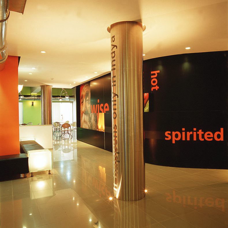
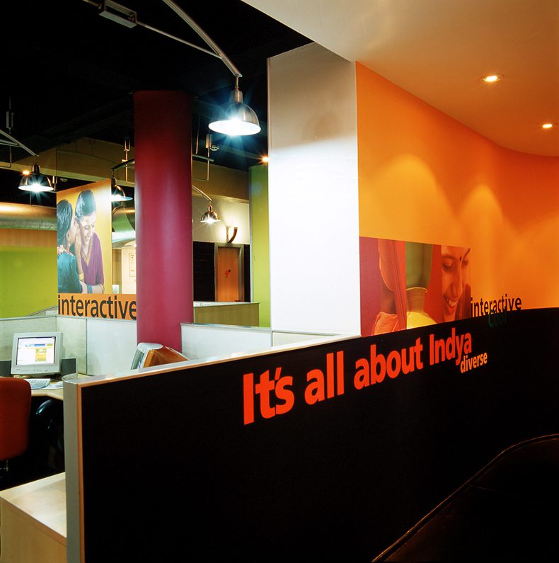
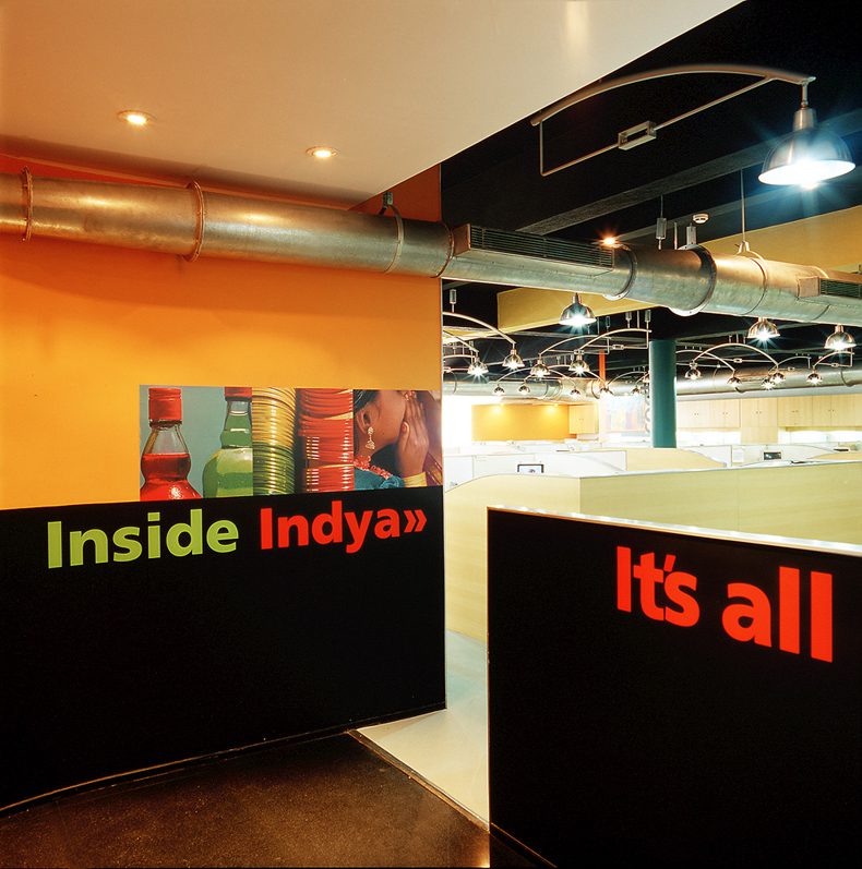
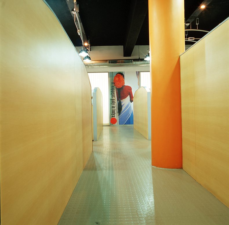
The first challenge was to create a feeling of light and openness on each floor with a restricted ceiling height of 8’-6”. We chose to paint the ceiling black and divert attention from the clutter of beams. A unique suspended lighting system and exposed HVAC ducting created an industrial language.
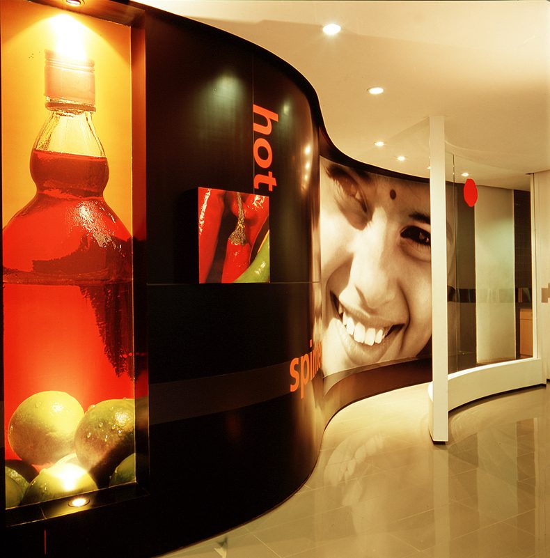
We introduced a minimal vocabulary of steel, glass and light beech wood and collaborated with graphic designers tsk Design, who in turn contrasted it with the sheer warmth and Indianness of saturated colours and larger than life graphics of urban street images.
This presented an interactive, bright, comfortable and youthful environment for the 18-25 year old programmers who often worked 20 hour days during the dot com boom.
This deliberate synthesis articulated a contemporary design aesthetic perfect for the “Indian with attitude” flavor of the company.
ClientMicroland
Project Details
22,000 sq. ft.
Bangalore, 2000
Photographer
Pallon Daruwala
