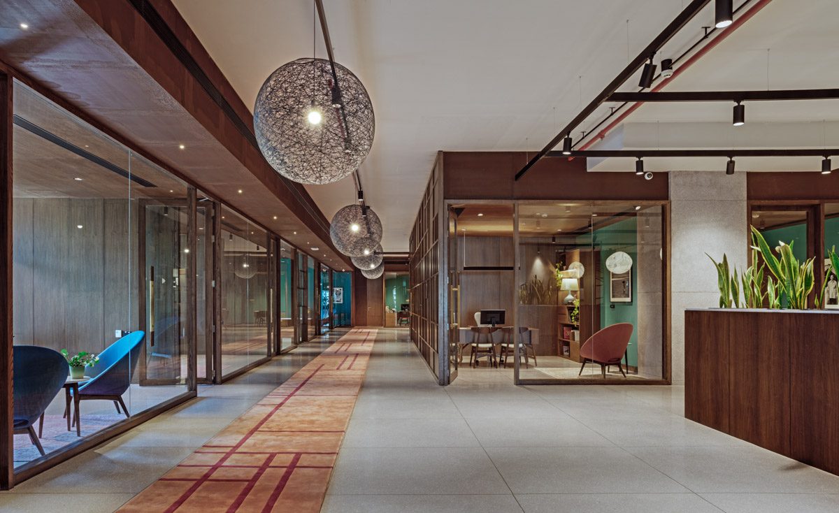
We were commissioned to design the corporate offices of leading investment firm Westbridge Capital in Bangalore.
Our clients wanted to retain the spirit of collaboration found in an open office or co-working environment, while also incorporating such requirements of privacy and hierarchy in a standard office layout.
In our various deliberations on space allocation and programming, the key concerns were to be able to strike a balance between collaborative and private zones.
The 16,500 sft of area with just under 40 employees enabled a very generous space allocation of 450 sft. Per person, which is almost triple the textbook prescribed standards for a corporate office. This low-density requirement allowed for some elbowroom in our space planning.
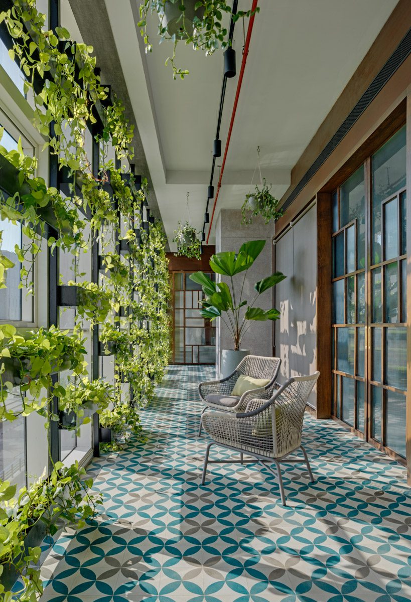
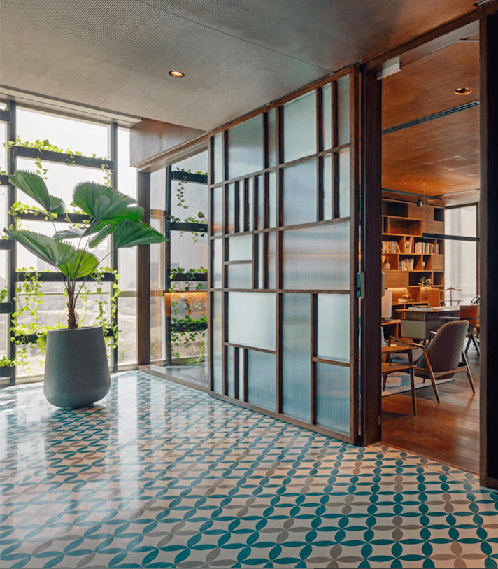
Rather than push all the senior management cabins and prime conference and lounge spaces to the periphery of the office to claim the best views and natural light, we deliberately chose to set them in. This created two 12ft wide common verandah-like spaces with casual outdoor seating, patterned terrazzo floor tiles and Biophilia. 60 ft long vertical green walls on the peripheries of the verandahs filter the afternoon sun and provide casual breakout spaces abundant with nature; a welcome contrast to the formality of the rest of the office.
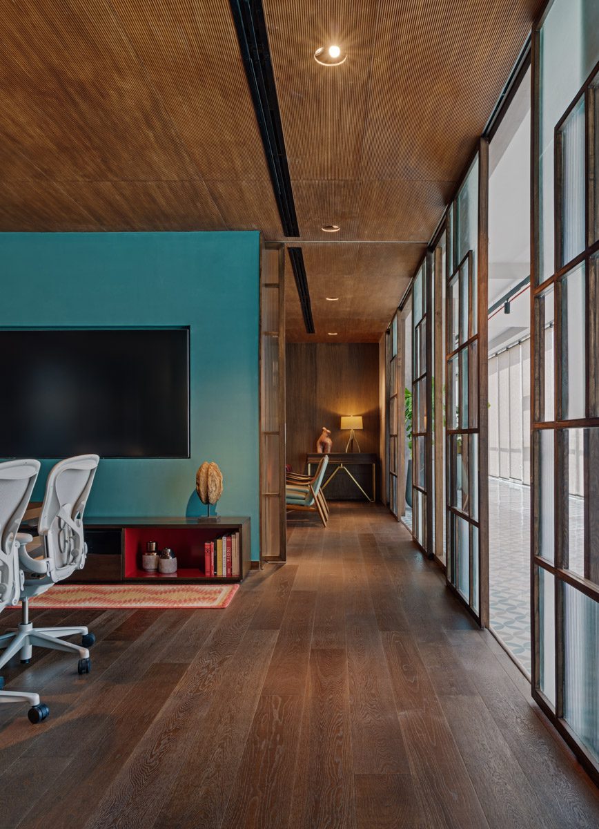
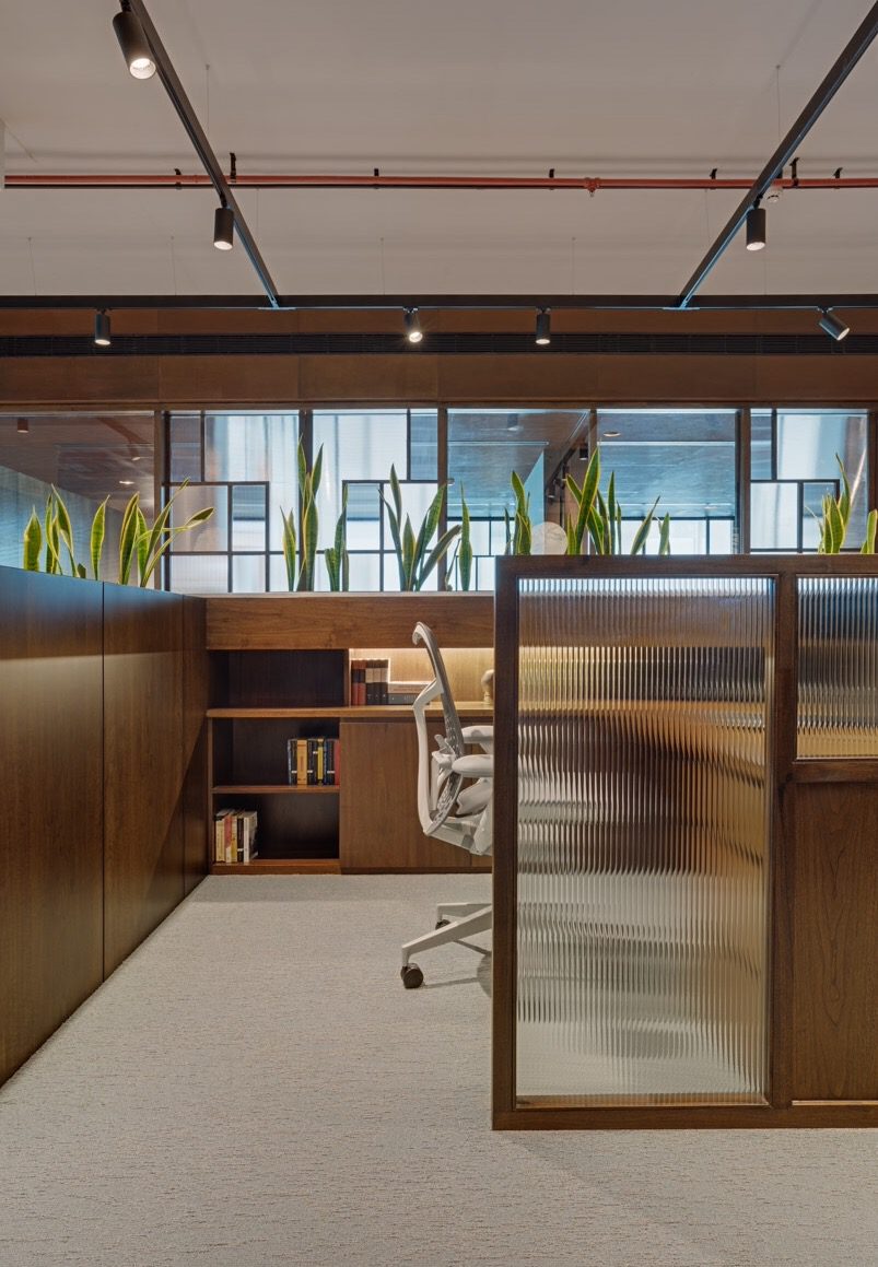
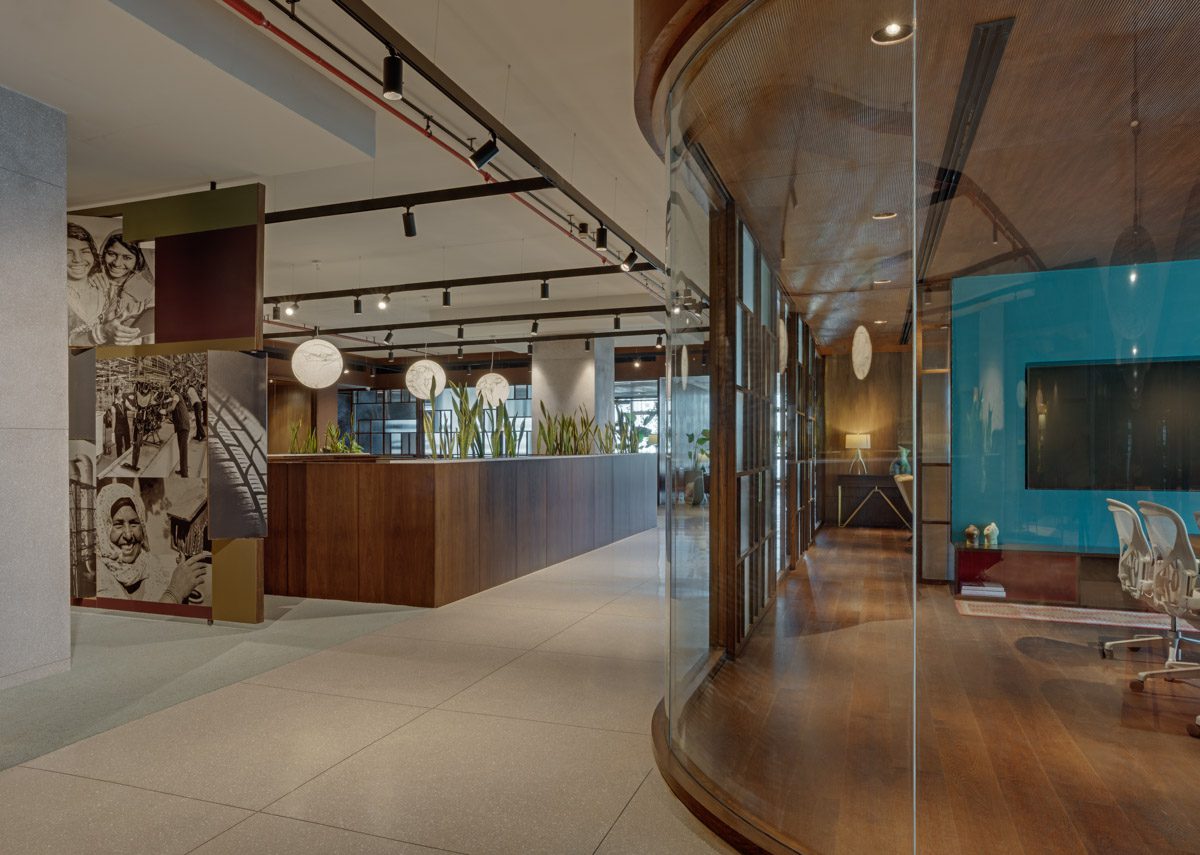
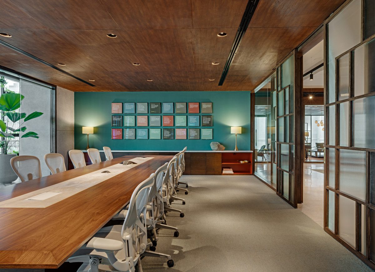
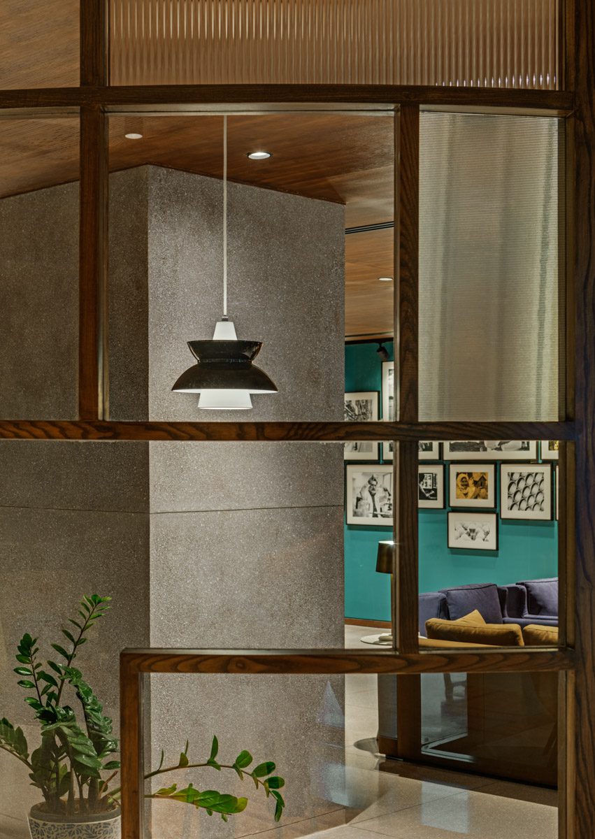
Another important architectural device are the geometrically composed timber and fluted glass lattice screens that act both as dividers and sliding privacy screens throughout the office. Leading from the entrance lobby, an imposing curved lattice screen sweeps past the foyer into the main office, hugging the café and lounge. In other instances, these screens slide along the threshold of the senior management cabins, lounges, meeting rooms and the main conference room, providing degrees of privacy as and when required.
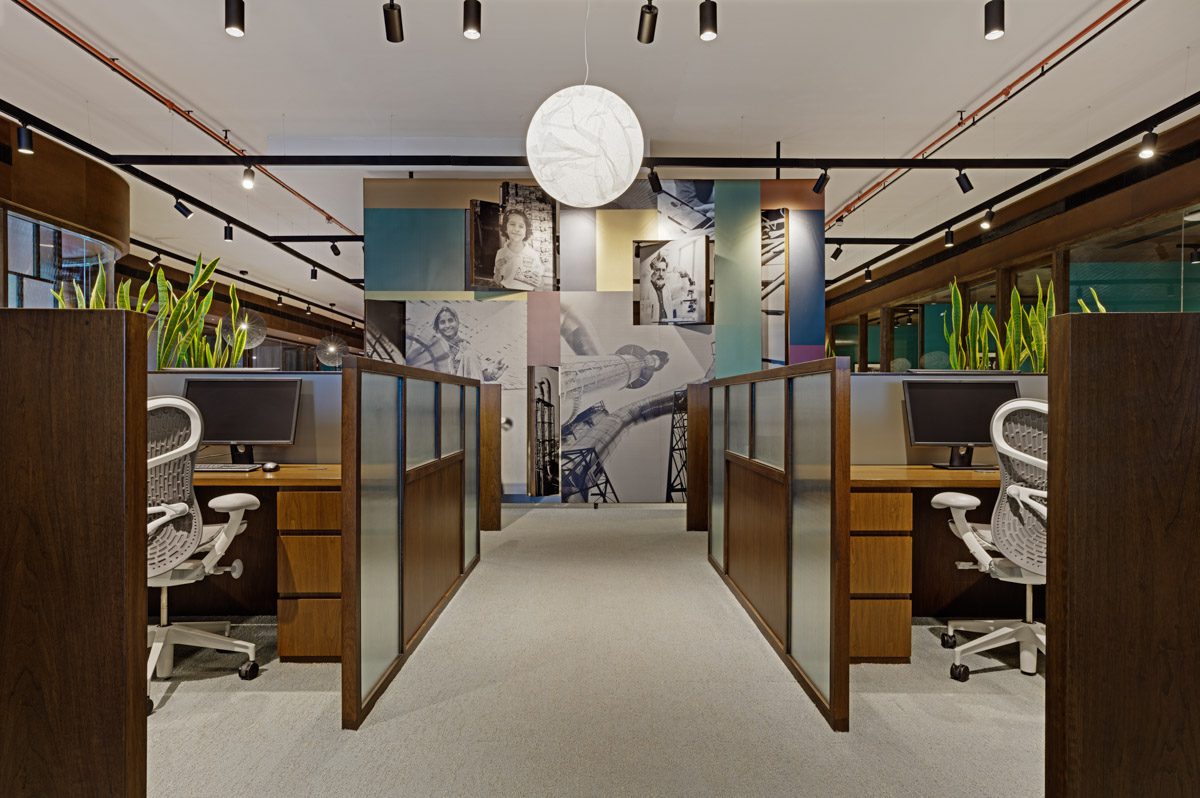
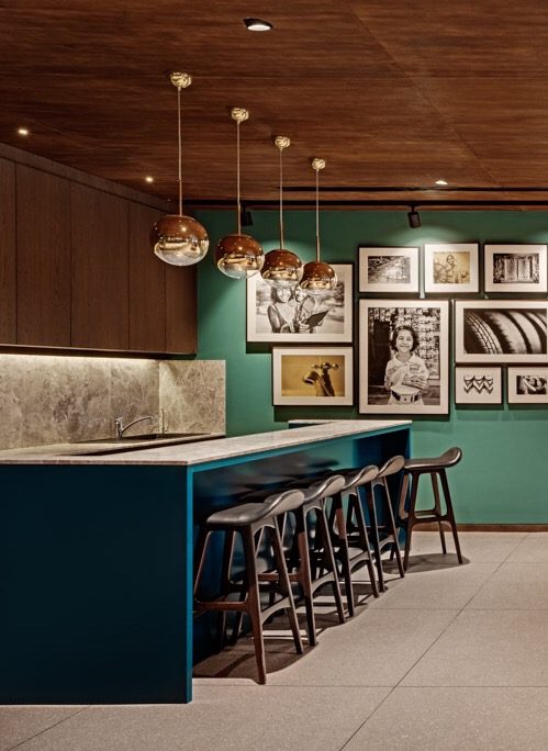
Spatially the office layout attempts to strike the right balance between social areas and those that promote serious business. The Café is the office’s social hub, where lounging to watch a cricket match, playing a game of pool, getting a coffee from the bar or a freshly cooked meal from the kitchen eases long hours of a typical workday. The senior management cabins, meeting rooms and the main conference room surround a central core which houses 12 workstation cubicles. The placement of these ensures ease of work and a visual connection between one space and the other at all times.
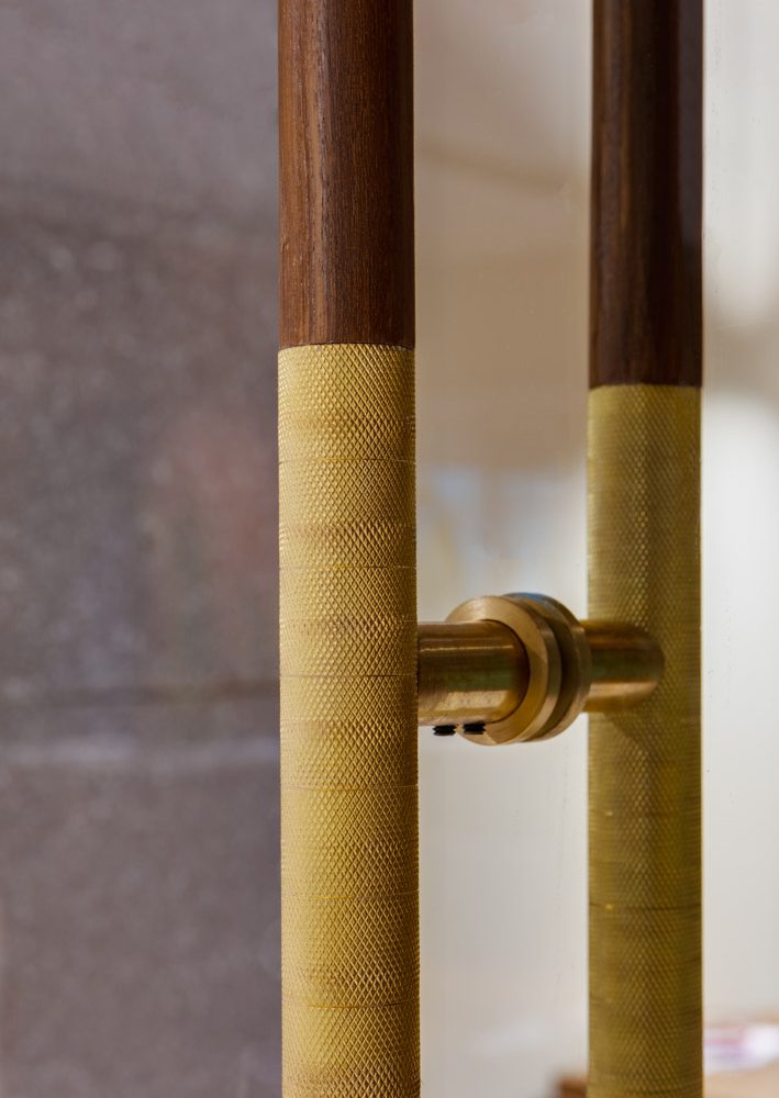
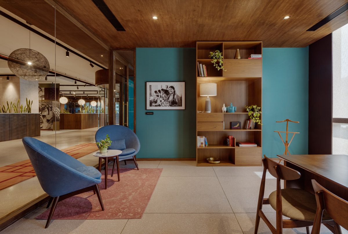
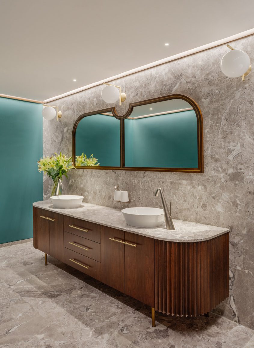
The materiality of the office has natural textures and deep tones, and elements like the fluted lattice screens and mid-century furniture and lighting evoke a sense of nostalgia. The main flooring has large expanses of cast-in-situ grey terrazzo and this contrasts with the warmth of ribbed wood on ceilings, hand knotted carpets, Indoor plants, walnut cabinetry filled with books, soffits of corten steel and a colour scheme of teal and burgundy.
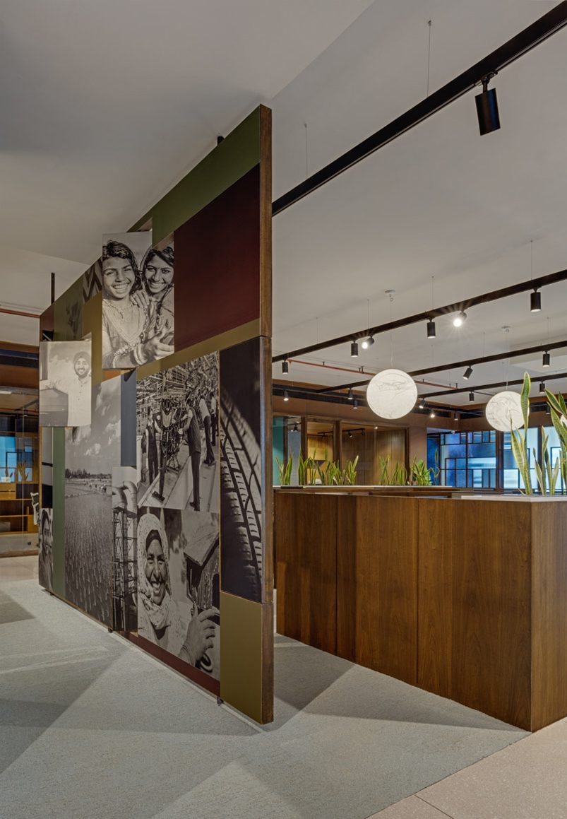
The environmental graphics within the office are brought to life on certain focal walls by brand identity firm TSK Design. The highlight is a freestanding wall that divides the central cubicles. It pays tribute to the companies that Westbridge has invested in and shows the diversity of their portfolio across various industries. Digitally printed on zinc and aluminium sheets, the wall has a collage of images on either side, with certain portions that cleverly pivot outwards revealing its dimensionality. The visual language is to celebrate the manufacturing process within each industry. In the entrance reception, a teal wall has a wood and brass installation with the names of all the companies in their portfolio highlighted.
Rather than blindly follow a ‘one size fits all’ solution, we were keen to arrive at a customized fit for Westbridge that would address their workflows while promoting a sense of well being for their employees. As work and social activities continue to blur in the office environment, the open plan workspace is the trendy default; However we questioned the lack of audio and visual privacy caused by these environments. We therefore opted for a hybrid workspace, a mix of cubicles and collaborative space that would lead to increased productivity.
ClientWestbridge Capital
Project Details
Bangalore, 2019
Photographer
Shamanth Patil J.



Our vision for the office was to have a space that serves us well functionally and is aesthetically elegant. We got that. In addition, we also got the uniqueness, beauty and warmth of a creative studio coupled with the refuge of a calming home Sandeep Singhal, Co-Founder and MD, Westbridge Capital
